Filter Specific Configuration
Filter Specific Configuration (MANADEV -> Layered Navigation)
- Layered Navigation Filters
- Individual Filter Configuration
- General Tab. General Information
- Colors and Images Tab. Colors and Images (Picker)
- Colors and Images Tab. Colors and Images (State)
- Colors and Images Tab. Options
Layered Navigation Filters
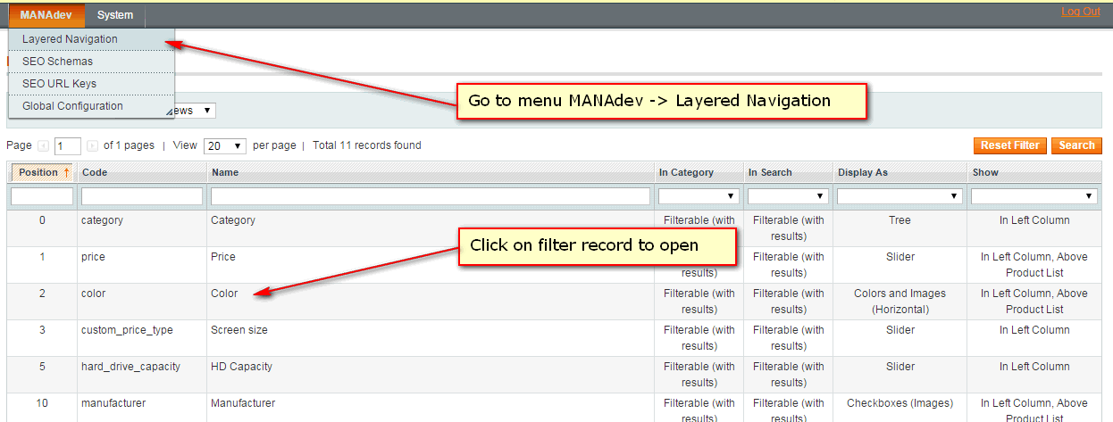
MANAdev -> Layered Navigation
All store filters (filterable attributes and categories) are listed in MANAdev -> Layered Navigation menu and every filter can be customized there individually.
Individual Filter Configuration
MANAdev -> Layered Navigation -> [filter]
After clicking a filter in Layered Navigation filter list, new window opens with filter options.
Please note, there are several tabs like General, Advanced, Colors and Images, and after clicking the tab, appropriate section will be shown. Some tabs might be shown or hidden depending on different filter configuration.
General Tab. General Information
Name - filter block label, which appears in frontend. Filter name also is used to build URL. Name could be set on store level. If `Use Attribute Configuration' is checked, attribute label will be used.
In Category - to show or hide filter block in Layered Navigation on category pages. This parameter also used for Layered Navigation on CMS pages or in Shop By Brand MANAdev extension. This parameter overrides
Use In Layered Navigationvalue, which is set for attribute.- No - filter will not be shown in Category Layered Navigation
- Filterable (with results) - filter is shown in Category Layered Navigation. However only options, where product are available will be listed for the filter.
- Filterable (no results) - filter is shown in Category Layered Navigation. If filter is set as
Filterable (no results), it will list all options, even no products are available now for specific option
In Search - to show or hide filter block in Layered Navigation on quick search pages. This parameter overrides
Use in Search Results Layered Navigationvalue, which is set for attribute.- No - filter will not be shown in Quick Search Layered Navigation.
- Filterable (with results) - filter is shown in Quick Search Layered Navigation. However only options, where product are available will be listed for the filter.
- Filterable (no results) - filter is shown in Quick Search Layered Navigation. If filter is set as
Filterable (no results), it will list all options, even no products are available now for specific option
General Tab. Display Settings
Display parameter - here you can change filter appearance by choosing different template like text list or color picker.
- Text (Multiple Select Enabled) - few options of the same filter can be chosen like
SkirtsandDresses.
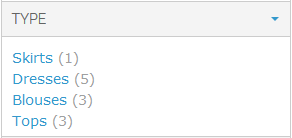
- Text (One Item Can Be Selected At A Time) - only one filter option can be chosen at a time like only
Skirtsor onlyDresses.

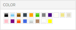
- Colors and Images (Horizontal) will show all swatches, placed horizontally:
- Colors and Images (Vertical) will place all color or images in a vertical order:
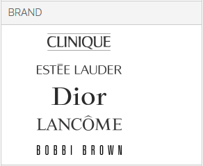
- Colors and Images (with Labels) will show all swatches in a vertical line with names:
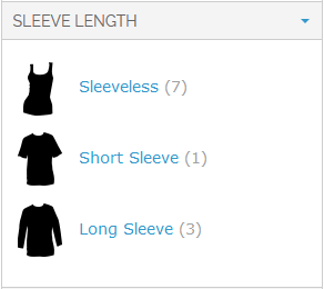
- Colors and Images with Labels (One Item Can Be Selected At A Time)) ill show all colors in a vertical line with color names, but only one color can be selected at at time:

- Text (Multiple Select Enabled) - few options of the same filter can be chosen like
Position - filter position. Filters with lower position will be highest on the Layered Navigation.
Sort Items By - how filter options are sorted inside filter.
- Position - all filter options are sorted by attribute option position. Options with lower position will be highest on the list. Option positions are set in Magento attribute management.
- Position (selected at the top) - all filter options are sorted by attribute option position, but selected options will be placed higher.
- Name - all filter options are sorted by attribute option name in ascending order.
- Name (selected at the top) - all filter options are sorted by attribute option name in ascending order, but selected options will be placed higher.
- Count - options with the largest products count will be highest on the list.
- Count (selected at the top) - options with the largest products count will be highest on the list, but selected options will be placed higher.
Combine Multiple Selections Using - defines how products will be chosen, If several options are selected within one filter.
- Logical OR - products, having ANY of selected options assigned will be shown. For example, if
blueandredoptions for color filter are selected, blue products and red product and even those product which are red/blue will be shown. - Logical AND - only products, having ALL selected options assigned will be shown. It is mostly applicable to
Multiple Selecttype attributes.
For example, "Decoration" attribute is of
Multiple Selecttype and has some options defined: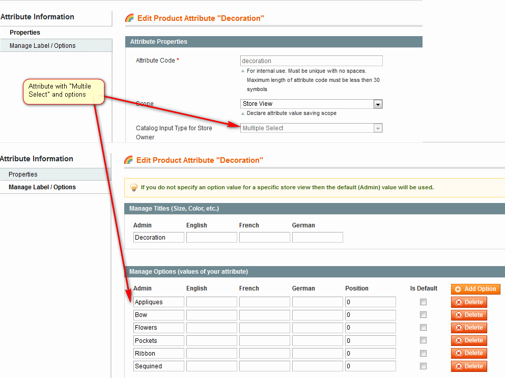
When product is created, several options can be assigned:
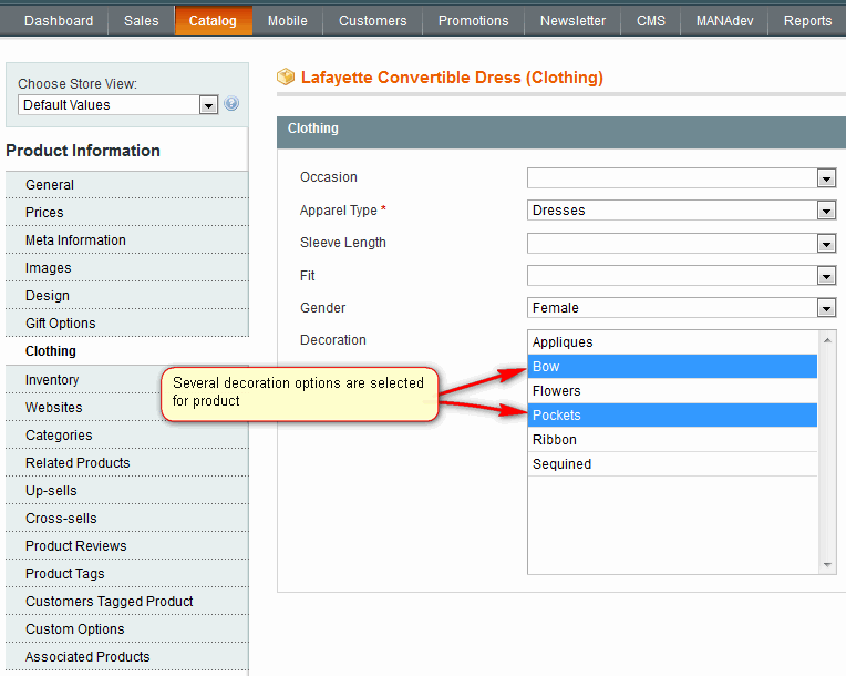
If
Logical ANDis set forDecorationfilter, then only products having bothPocketsandBowoptions assigned will be shown when these two options are selected in Layered Navigation.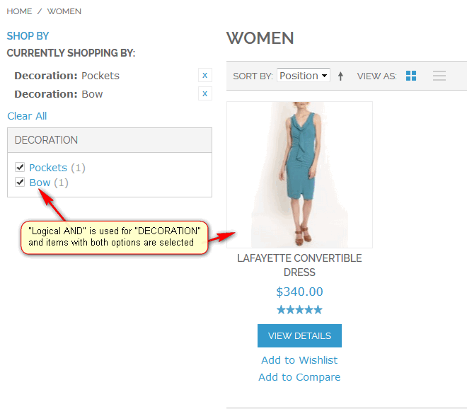
- Logical OR - products, having ANY of selected options assigned will be shown. For example, if
Reverse Mode. If enabled, shows all options as selected and allows user to deselect items he/she is not interested in.
Filterable (no results) Links Are Not Clickable. If filter is set as
Filterable (no results), it will list all options, even if no products are available. This parameter makes such options non clickable.For example, field
Use In Layered Navigationis set toFilterable (no results)for filter "Type":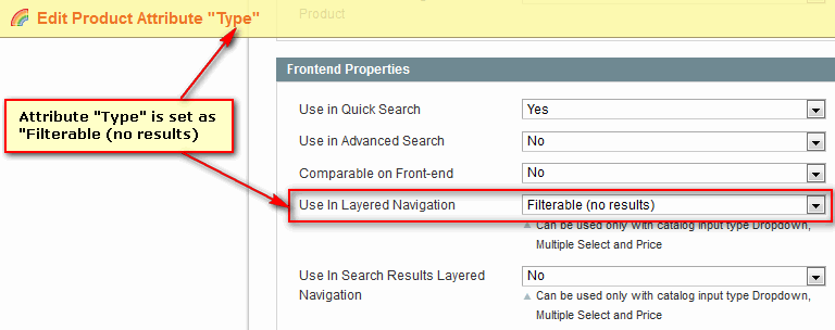
In layered navigation, options without available products will be non clickable, if this parameter is set to
Yes: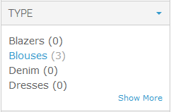
Colors and Images Tab
How to create color or image picker is described in How To Create Color Picker
Additional tab Colors and Images appears, when Display parameter is set to one of options below :
- Colors and Images (Horizontal)
- Colors and Images (Vertical)
- Colors and Images (with Labels)
- Colors and Images (One Item Can Be Selected At A Time)
Here you can finalize your color picker visualization.
Colors and Images Tab. Colors and Images (Picker)
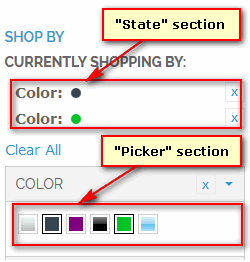
There are two different sections in layered navigation, that can be configured: Picker and State. Picker is a palette of all possible colors or options, while State contains information about selected elements:
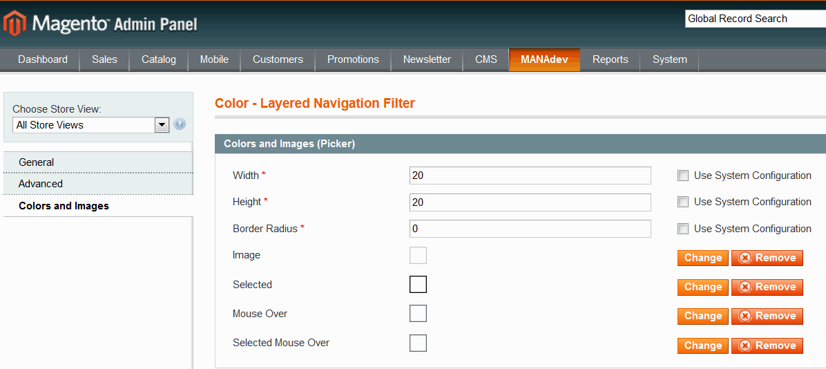
Colors and Images (Picker) group of settings define default visualization and behavior of every swatch:
- Width and Height will define size of color swatch.
- Border Radius allows to add rounder borders to an element
- Image, Selected, Mouse Over and Selected Mouse Over This section allows to add additional top layer over all swatches which might be used as a mask to give specific shape for a swatch (for example heart shape swatches) or additional border.
Graphical file for the mask can be uploaded using buttons Add or Change, or can be removed, if you do not need it anymore.
Colors and Images Tab. Colors and Images (State)
Colors and Images (State) settings are used for visualization of selected filter options:

- Width andHeight will define size of state element.
- Border Radius allows to round corners to an element, where 0 means square.
- Image is a mask for element, which will be applied to on top of selected element image.Graphical file for the mask can be uploaded using buttons Add or Change, or can be removed, if you do not need it anymore.
Colors and Images Tab. Options
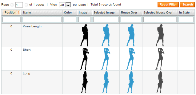
Option settings are used for visualization of every swatch element:

For every swatch element (in our case - color) you can set:
- Color - swatch color, which will be shown, if image is not provided.. Using color selecting control you can set a Hex value of the color of a swatch.
- Image - is a graphical image which will be used to show the swatch element.
- Selected Image - is a graphical image which will be shown when option is selected.
- Mouse Over is a graphical image which will be used when mouse is over the option.
- Selected Mouse Over is a graphical image which will be shown when mouse is over the selected element .
- In State is a graphical image which will be shown in "State" section for the selected element.
In case you want to have image picker, you can upload images for different states: ordinal image, image when item is selected, ordinal image when mouse is over the item and selected item when mouse is over it.
Hint: In case image picker should look the same in spite of the state of the filter - normal, selected, mouse over it or selected with mouse over it - it is recommended to set the image only for one
Imagecolumn. It will help to avoid image flicker.
Here is the example of Length filter configuration.
