How To Create Color Picker
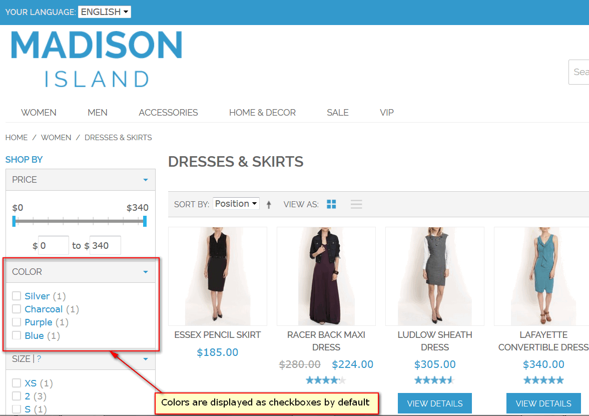
After extension is installed, usually color filter will be presented in store frontend as a list of named checkboxes:
MANAdev give a powerful tool set to modify visualization of selecting colors, as well as setting up other types of pickers. Here is a guide for customizing color and image swatches.
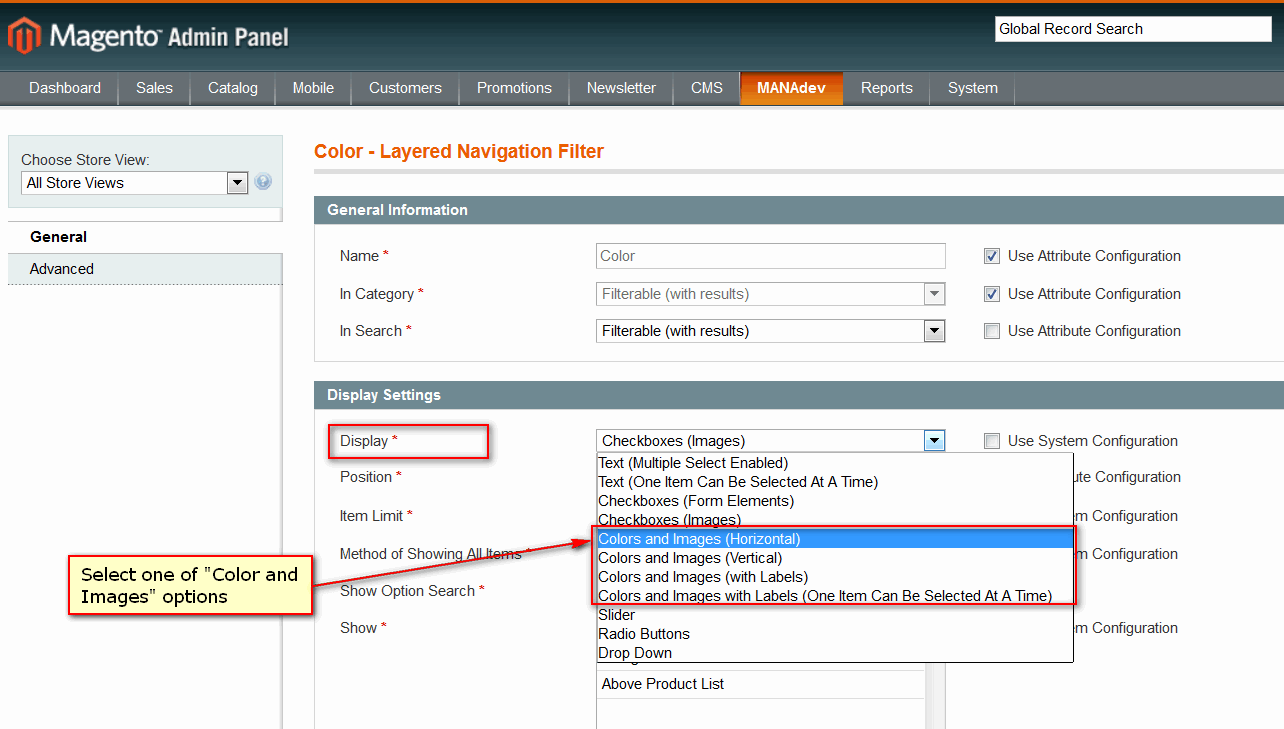
In Magento Admin Panel go to menu MANAdev-> Layered Navigation, find attribute and open it for editing. For color swatches, filter Color can be selected.
In General tab Display parameter one of Colors and Images options should be selected :
Colors and Images (Horizontal) will show all swatches, placed horizontally:

Colors and Images (Vertical) will place all color or images in a vertical order:
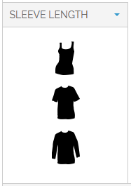
Colors and Images (with Labels) will show all swatches in a vertical line with names:
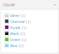
Colors and Images (One Item Can Be Selected At A Time) will show all colors in a vertical line with color names, but only one color can be selected at at time

Hint: If you cannot see any change in frontend, after you change the parameters, try to refresh your browser cache by pressing Ctrl + F5.
There are two different sections in layered navigation, that can be configured: Picker and State. Picker is a palette of all possible colors or options, while State contains information about selected elements:
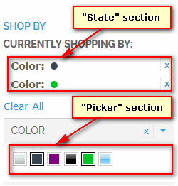
When Display parameter is set to one of above option, additional tab Colors and Images will appears. Here you can finalize your color picker visualization.
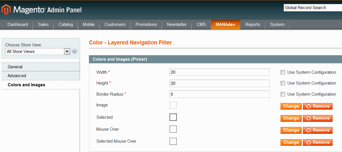
Colors and Images (Picker) group of settings define default visualization and behavior of every swatch:
- Width and Height will define size of color swatch.
- Border Radius allows to add rounder borders to an element
- Image, Selected, Mouse Over and Selected Mouse Over This section allows to add additional top layer over all swatches which might be used as a mask to give specific shape for a swatch (for example heart shape swatches) or additional border.
Graphical file for the mask can be uploaded using buttons Add or Change, or can be removed, if you do not need it anymore.
Colors and Images (State) settings are used for visualization of selected filter options:

- Width andHeight will define size of state element.
- Border Radius allows to round corners to an element, where 0 means square.
- Image is a mask for element, which will be applied to on top of selected element image.Graphical file for the mask can be uploaded using buttons Add or Change, or can be removed, if you do not need it anymore.
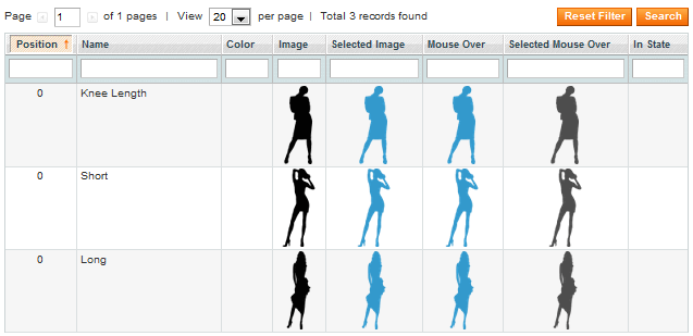
Option settings are used for visualization of every swatch element:

For every swatch element (in our case - color) you can set:
- Position is relative position of the option in the whole palette.
- Name is a swatch name. Can be visible in a a label, if filter display type is "Colors and Images (with Labels)", or in tooltip, when mouse is over the element.
- Color - swatch color, which will be shown, if image is not provided.. Using color selecting control you can set a Hex value of the color of a swatch.
- Image - is a graphical image, uploaded from a file. Will be used to show the swatch element.
- Selected Image - is a graphical image, which will be shown when option is selected. If not provided, picture from
Imageparameter will be used. - Mouse Over is a graphical image, which will be used when mouse is over the option. If not provided, picture from
Imageparameter will be used. - Selected Mouse Over is a graphical image, which will be shown when mouse is over the selected element. If not provided, picture from
Imageparameter will be used. - In State is a graphical image, which will be shown in "State" section for the selected element
In case you want to have image picker, you can upload images for different states: ordinal image, image when item is selected, ordinal image when mouse is over the item and selected item when mouse is over it.
Hint: In case image picker should look the same in spite of the state of the filter - normal, selected, mouse over it or selected with mouse over it - it is recommended to set the image only for one
Imagecolumn. It will help to avoid image flicker.
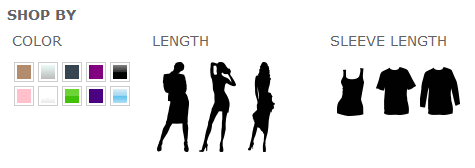
Here is the example of Length filter configuration.
