Global Configuration
Global Configuration (MANAdev -> Global Configuration -> Layered Navigation)
- Display Settings
- Advanced Display Settings
- Filter Positioning
- Mobile Layered Navigation
- 'Above Products' Filters As Drop Down Menu Options
- 'Above Products' Filters As Horizontally Laid Filter Options
- Search Engine Optimization
- Session Settings
- Colors and Images
- Show More Popup
- Category Tree
- Radio Buttons
- Sliders
- Other Settings
Global Configuration
MANAdev -> Global Configuration -> Layered Navigation
In order to access global configuration, go to menu MANAdev -> Global Configuration -> Layered Navigation in Magento Admin Panel.

Display Settings
Section defines how to show layered navigation in general. First four parameters sets up default templates for all filter types.
Later on, every specific filter can be customized in MANAdev -> Layered Navigation menu.
Show Category Filter As - default template for category filter. Below possible choices and preview are listed:
Text (One Item Can Be Selected At A Time) - list of subcategories is shown. Only one subcategory can be chosen at a time like only
New Arrivals.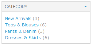
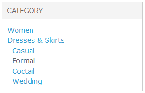
Parents and Children (One Item Can Be Selected At A Time) - categories, current category and direct child categories of current category are shown. Only one category or it's subcategory can be chosen at a time.
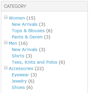
Tree - all categories and subcategories are shown as a tree.
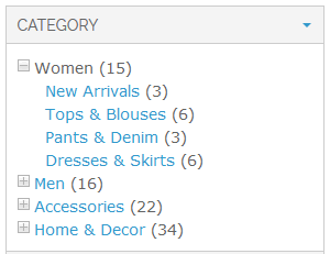
Tree (2nd level and down) - subcategories are shown as a tree:
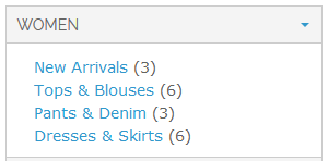
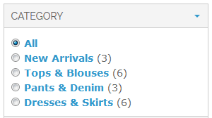
Radio Buttons - subcategories are shown as list of radio button options.
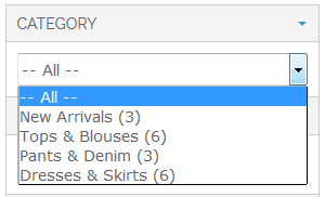
Drop Down - subcategories are shown as drop down list.
Show Price Filter As - default template for system attribute
pricefilter. Below possible choices and preview are listed:Text (Multiple Select Enabled) - price ranges will be shown as a list. Few price ranges can be chosen at a time.
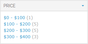
Text (One Item Can Be Selected At A Time) - price ranges will be shown as a list. Only one range can be chosen at a time.

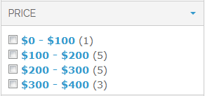
Checkboxes (Form Elements) - price range list with checkboxes is shown.
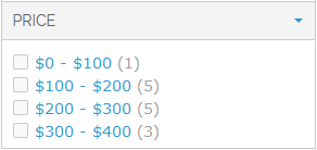
Checkboxes (Images) - price range list with checkboxes is shown. Checkbox images will look the same way in different browsers.
Slider - price range can be modified by dragging thumbs.
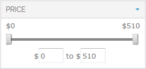
Range Inputs - min and max range values are edited manually.

Radio Buttons - price ranges are shown as list of radio button options.
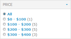
Drop Down - price ranges are shown as drop down list:
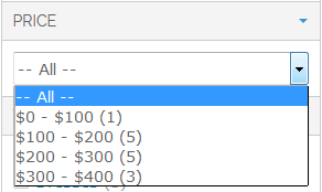
Show Filters of Type 'Price' As- default template for all filters, based on
pricetype attribute.Text (Multiple Select Enabled) - price ranges will be shown as a list. Few price ranges can be chosen at a time.
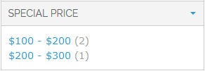
Text (One Item Can Be Selected At A Time) - price ranges will be shown as a list. Only one range can be chosen at a time.

Checkboxes (Form Elements) - price range list with checkboxes is shown.
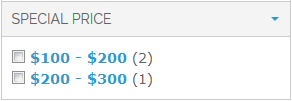
Checkboxes (Images) - price range list with checkboxes is shown. Checkbox images will look the same way in different browsers.
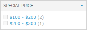
Slider - range can be modified by dragging thumbs.
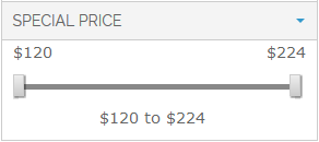
Range Inputs - min and max range values are edited manually.

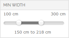
Min/Max Slider range can be modified by dragging thumbs.
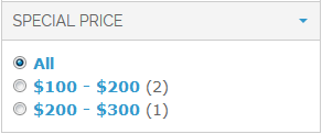
Radio Buttons - range can be modified by dragging thumbs.
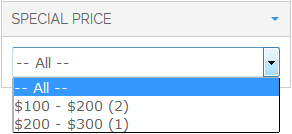
Drop Down - range can be modified by dragging thumbs.
Show All Other Filters As- default template for all filters, based on
drop downormultiple selecttype filters.Text (Multiple Select Enabled) - few options of the same filter can be chosen like
SkirtsandDresses.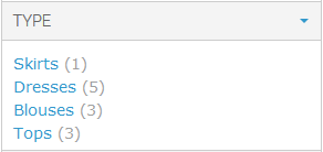
Text (One Item Can Be Selected At A Time) - only one filter option can be chosen at a time like only
Skirtsor onlyDresses.
Checkboxes (Form Elements) - list with checkboxes is shown.
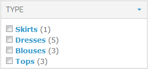
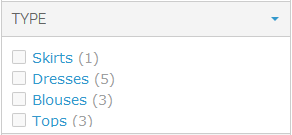
Checkboxes (Images) - list with checkboxes is shown. Checkbox images will look the same way in different browsers.
Colors and Images (Horizontal) will show all swatches, placed horizontally:
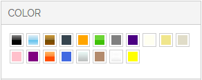
Colors and Images (Vertical) will place all color or images in a vertical order:
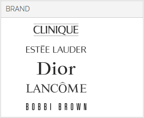
Colors and Images (with Labels) will show all swatches in a vertical line with names:
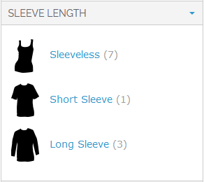
Colors and Images with Labels (One Item Can Be Selected At A Time)) ill show all colors in a vertical line with color names, but only one color can be selected at at time:

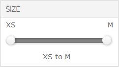
Slider - range can be modified by dragging thumbs.
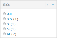
Radio Buttons - range can be modified by dragging thumbs.
Drop Down - range can be modified by dragging thumbs.
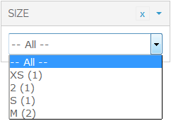
Sort Items By - default template for all
drop downormultiple selecttype filters. Not applicable to category or price filters.- Position - filter options will be sorted by position.
- Position (selected at the top) - same as previous, but currently selected options will be placed on top of the list.
- Name - filter options will be ordered by translated name of options.
- Name (selected at the top) - same as previous, but currently selected options will be placed on top of the list.
- Count - filter options with bigger product count will be placed higher.
- Count (selected at the top) - same as previous, but currently selected options will be placed on top of the list.
Show Product Count - global setting for showing or hiding product count near all filter options. Not applicable to sliders.
Filterable (no results) Links Are Not Clickable. If filter is set as
Filterable (no results), it will list all options, even no products are available now for specific option. This parameter let to disable clicking on option, if there are no products suitable for this option.For example, field
Use In Layered Navigationis set toFilterable (no results)for filter "Type":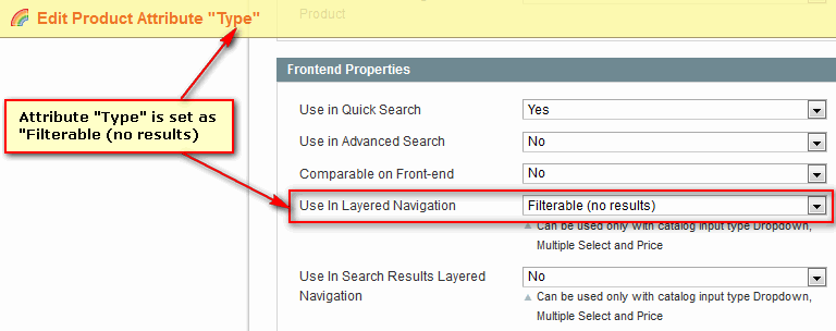
In layered navigation, options without available products will be non clickable, if this parameter is set to
Yes: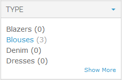
Hide CMS Page Content When Filters Are Applied
Layered Navigation can be added to any CMS page, including Home Page. In detail it is described in How to section: How to put Layered Navigation on Home Page (or Any CMS Page).
Here is an example of CMS page with layered navigation, content and product list.
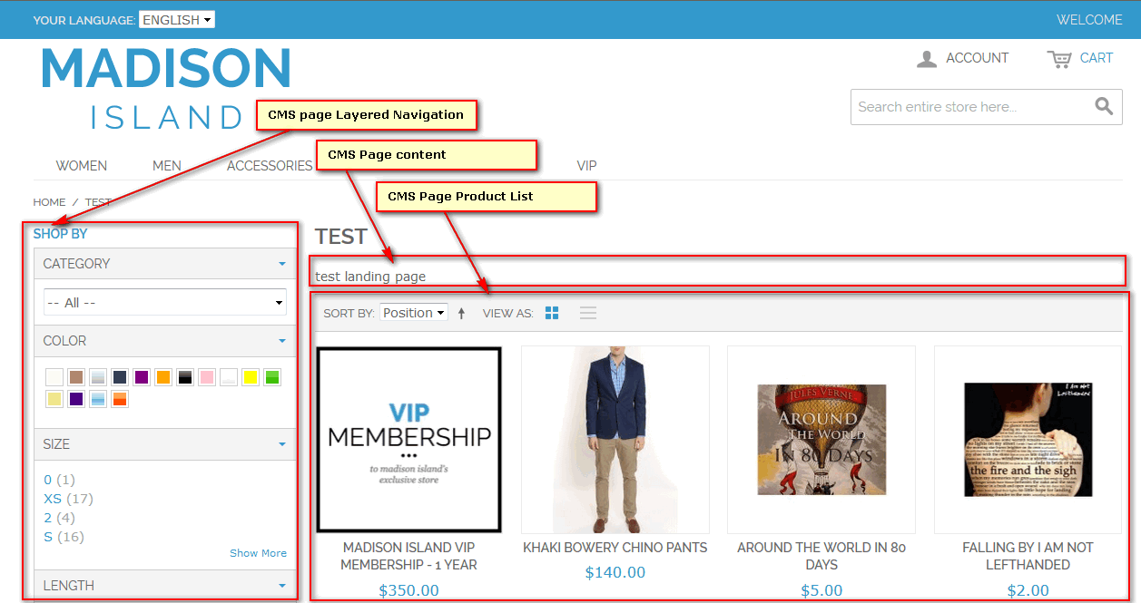
Sometimes it is not reasonable to show CMS page content, if customer start to search products by applying one or more filters. The parameter let you to hide page content block, if any filter option is selected.
This parameter is global for all CMS pages. Therefore it is more suitable for small stores.
Hide CMS Page Product List When No Filters Are Applied. In some cases, when product list is huge, it is reasonable to hide products in CMS page, if no any filter applied.
This parameter is global for all CMS pages. Therefore it is more suitable for small stores.
If both parameters are set to
Yes, CMS page layout will be changed dynamically:- If no any filter is applied, only layered navigation and CMS page content will be shown. Product list will be hidden.
- If one or more filters are applied, layered navigation and filtered product list will be shown. CMS page content will be hidden.
For specific CMS page both settings can be override by changing layout manually. In detail it is described in How to section: How To Customize Visibility Of Content Or Product List For Specific CMS Page.
Hide Filters With Single Visible Item. To have more compact layered navigation, it is possible to hide filters with one visible item, if parameter is set to
Yes: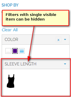
Item Limit - global parameter for showing filters with large number of items. Set up initial limit of visible item count. In case filter has more than specified number of items, only first items are displayed, as well as 'Show More' and 'Show Less' actions are available.
Reserve Additional Space for Not Visible Selected Items - global parameter for showing filters with large number of items. If set to
Yes, will add additional space when user select more items than it set inItem limitparameter. Works for all methods of showing long lists. Best usage is when list is sorted withselected at the topoptions.Yes will show all selected items in spite
Item limitparameter value. For example, ifItem limitequal to 4 and user has selected 6 items, all 6 selected items will be visible: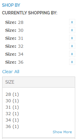
No will always limit visible item count to
Item Limitparameter value in spite how many items are selected. For example, ifItem limitequal to 4 and user has selected 6 items, only 4 selected items will be visible: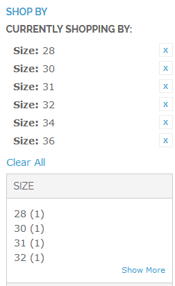
Expand/Collapse Time in Milliseconds - global parameter for showing filters with large number of items. Set up 'Show More' and 'Show Less' action duration in milliseconds. 'Preload All Items' parameter should be enabled.
Method of Showing All Items - global parameter for showing filters with large number of items. In case filter has more items, than number, set up in
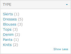
Item Limitparameter, only first items are displayed initially. There are several possibilities to show all items.- 'Show More' and 'Show Less' actions - 'Show More' link is visible initially. After
Show Moreis pressed, full list is shown and 'Show Less' action appears:
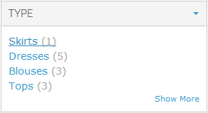
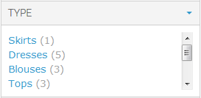
- Scroll bar - all items can be accessed by manipulating the scrollbar:
- 'Show More' popup - After
Show Moreis pressed, full list is shown in separate popup window

- 'Show More' and 'Show Less' actions - 'Show More' link is visible initially. After
Advanced Display Settings
There are 2 different ways for showing Layered Navigation.
One is to use standard template, which comes together with the theme. It is stored in catalog/layer/view.phtml.
Another is extended with advanced features and located in manapro/filteradvanced/view.phtml. Depending on your design, this file may need to be adapted to your theme.
- Enable Advanced Display Features parameter let to use a set of advanced features on store view.
- Show 'Clear' Action. If set to
Yes, 'Clear' action appears near the name of applied filter.

Group Filters By. Obsolete feature which let to group filter by attribute groups. If set to
Attribute groups, filters will be grouped in the same way as attributes are grouped.- Don't group filters
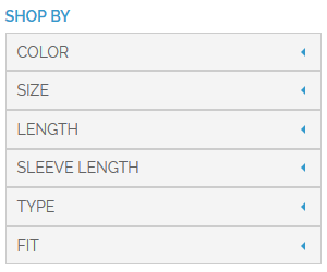
- Attribute groups
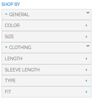
Expand/Collapse Groups. This parameter controls the behavior of filter groups. It makes sense to use it only if
Group Filters Byis set toAttribute groups.- Expanded, not collapsible
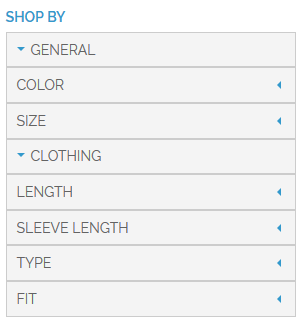
- Collapsible, initially collapsed
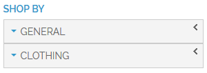
- Collapsible, initially expanded

Expand/Collapse/Dropdown Filters - global setting for showing filters. Could be modified for every specific filter.
- Expanded, not collapsible
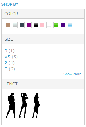
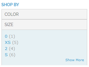
- Collapsible, initially collapsed
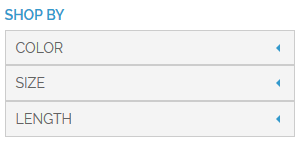
- Collapsible, initially expanded
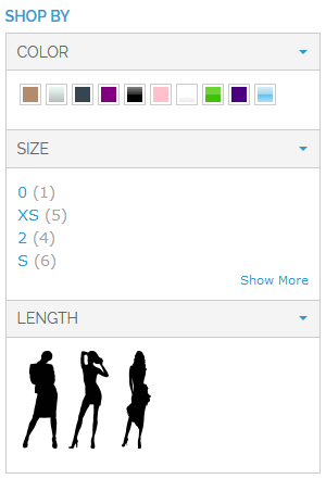
- Dropdown
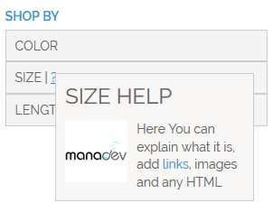
- Help Hint Popup Width - global parameter setting the width in pixels of all filter help hints. Help hints are explanations for the filter and are set on filter level. In the example below for Size filter Help Tooltip is provided.
Filter Positioning
This section describes the place and position of Layered Navigation filters.
Show Filters - default filter position on the page. In general, Layered Navigation could be placed on the left, right column or above product list. Several or even all options can be selected at at time. To select several options, keep
Ctrlkey pressed and click on the desired option. For each filter, positioning could be set individually.- In Left Column - Layered Navigation filters are shown in the left column
- In Right Column - Layered Navigation filters are shown in the right column
- Above Product List - Layered Navigation filters are shown above product list.
Show Applied Filters in Left Column. If some filer options are selected by the customers, they can be displayed in Currently Shopping by section. This parameter let to show or hide this section on the left column.
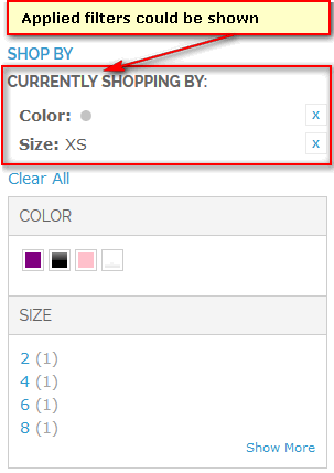
- No - applied filters will not appear in the left column
- Yes, Show All Filters Applied On Whole Page - applied filters will appear in the left column.
- Yes, But Only Filters Applied In This Block - obsolete parameter.
Show Applied Filters in Right Column. This parameter let to show or hide applied filters on the right column.
- No - applied filters will not appear in the right column
- Yes, Show All Filters Applied On Whole Page - applied filters will appear in the right column.
- Yes, But Only Filters Applied In This Block - obsolete parameter.
Show Applied Filters Above Products. This parameter let to show or hide applied filters in the Layered Navigation block above the product list.
- No - applied filters will not appear above the product list
- Yes, Show All Filters Applied On Whole Page - applied filters will appear above the product list.
- Yes, But Only Filters Applied In This Block- obsolete parameter.
Categories Block Position. Applicable only to category pages. Let to show sub category list in separate block.
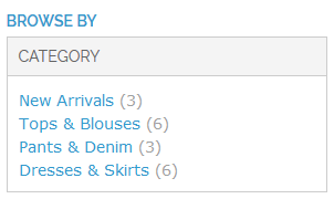
- Hide - do not show categories block. Instead of it, more powerful category filter can be used.
- In Left Column - show categories block in left column.
- In Right Column - show categories block in right column.
When categories block is shown in left or right column, it is recommended to disable
categoryfilter. In order to do it, go to menuMANAdev -> Layered Navigationin Magento Admin Panel, findcategoryfilter and selectNofor parametersIn CategoryandIn search:
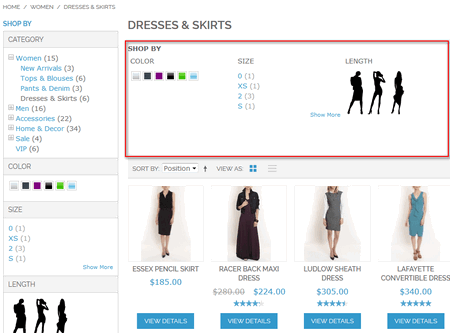
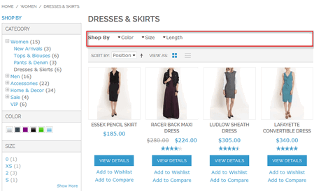
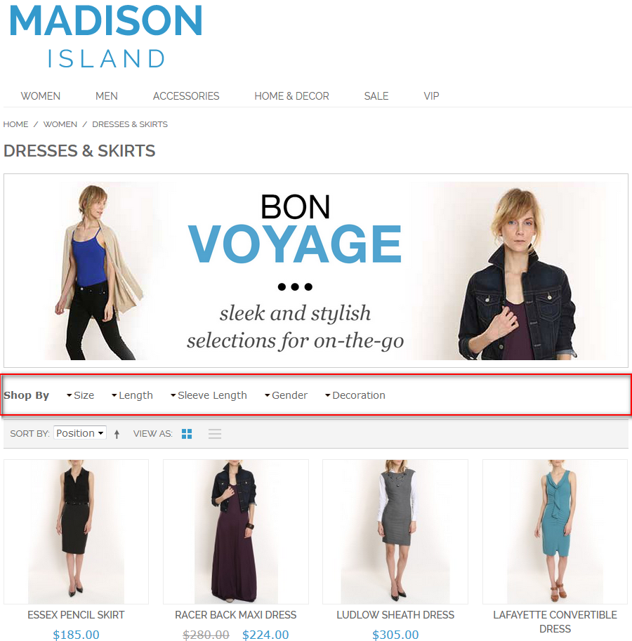
Show 'Above Products' Filters As parameter defines how layered navigation above product list should looks like.
Defined in Current Theme - reserved value
Horizontally Laid Filters - filters are placed one by one horizontally.
Drop Down Menu - filters are collapsed to drop down menu
Show 'Shop By' Text - to show or hide text
Shop By. Applicable Only to Layered Navigation 'Above Products'. Particularly important for one column layout.- Show 'Currently Shopping By' Text - to show or hide text
Currently Shopping By. Applicable Only to Layered Navigation 'Above Products' When CMS Static Block Is Shown, Position Top Layered Navigation . Parameter sets up layered navigation position relative to CMS static block. Applicable to category pages only, if category
Display Modeparameter is set toStatic block and products' andCMS Block` is selected.Before static block - layered navigation positioned before CMS static block in category page.
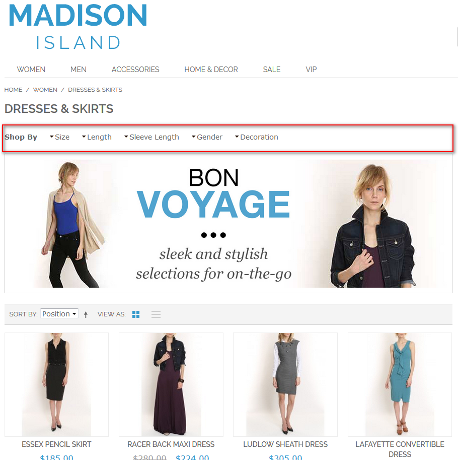
After static block - layered navigation positioned after CMS static block in category page.
Mobile Layered Navigation
This section contains settings affecting layered navigation view and behavior on mobile devices.
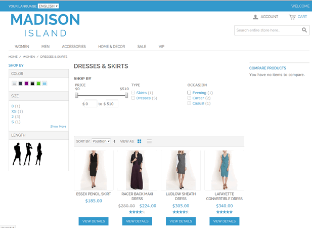
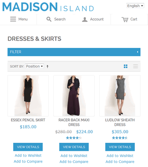
In general, with today's responsive theme popularity pages on mobile devices look and feel differently from their desktop counterparts, some blocks are moved to new positions, some might be hidden, some new blocks might be shown, design is changed in order to be more comfortable to be used on narrow touch screens, like:
- Two or three column page layout is transformed to one column page layout.
- Menu, search, account and cart blocks collapse to look like buttons.
- Product filters are shown just above products.
One of possible transformations from normal to mobile design is presented below.
Page with layered navigation on wide screen:
The same page on mobile device:
In SEO Layered Navigation Plus there is a feature which allows transforming layered navigation into mobile-friendly filters above products. To enable this feature:
- set Hide If Body Width Is More Or Equal To to maximum number of pixels on mobile devices, 751 is a good starting value.
- set Left and Right Column Filters to Move to mobile layered navigation.
Mobile Layered Navigation settings:
Hide If Body Width Is More Or Equal To. If body width is more or equal this number of pixels, mobile layered navigation block will be hided. Leave empty to disable mobile layout feature. Note that mobile layout may require theme-related CSS changes.
Left and Right Column Filters. Into the mobile layered navigation block all visible filters from left and right columns can be added.
Leave in columns. Left or Right filters are shown in separate blocks and not included into Mobile Layered Navigation
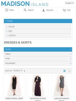
Move to mobile layered navigation. Left or Right filters are included into Mobile Layered Navigation and not shown separately
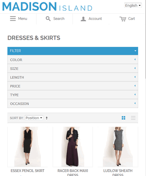
Copy to mobile layered navigation. Left or Right filters are shown in separate blocks and included into Mobile Layered Navigation
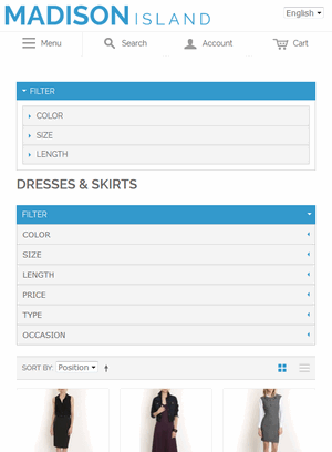
Behavior Every filter block can be:
- Initially collapsed, expanded manually
- Initially expanded, collapsed manually
- Accordion: one filter expanded at at time
Whole Block Is. Mobile Layered Navigation block can be
- Initially collapsed
- Initially expanded
Effect Duration. Expand/Collapse effect duration in milliseconds
Slider Style. Slider elements can be adjusted for touch screens:
- Same as desktop
- Hide slider, leave only input fields/labels
'Above Products' Filters As Drop Down Menu Options
If 'Above Products' Layered Navigation block is set as drop down menu, it is possible to set the min and max width of one drop down block:
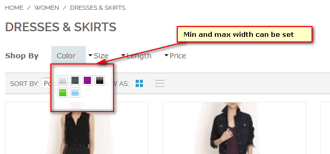
- Min Width. Value in pixels (only number). Applied to a part with options which drops down
- Max Width. Value in pixels (only number). Applied to a part with options which drops down.
Show Sliders - the way of showing slider filters in 'Above Products' drop down:
In Drop Down
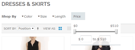
In Menu Line, Near Filter Name
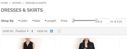
'Above Products' Filters As Horizontally Laid Filter Options
If 'Above Products' Layered Navigation block is set as 'Horizontally Laid Filters', it is possible to configure the way of showing filters for different content column width. It is especially actual for responsive design themes. Filters can be arranged in two, three, four and five elements in one row. Five column layout is used by default.
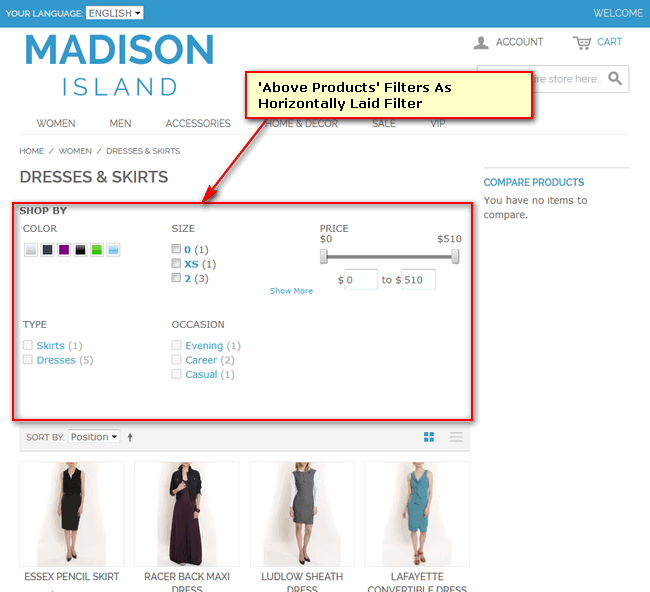
- Minimum Filter Height - minimal height for every filter in horizontally laid layered navigation. Value in pixels (only number). Use it if your filters will wrap into two or more rows, so the second and other rows flow nicely. Leave blank if filters always fit into one row.
- Two Columns Mode Maximum Width. When horizontal layered navigation is wider than specified number of pixels, this mode is not used. Leave empty to disable this mode. If none of width modes is used, five column layout is used.
- Three Columns Mode Maximum Width. When horizontal layered navigation is wider than specified number of pixels, this mode is not used. Leave empty to disable this mode. If none of width modes is used, five column layout is used.
- Four Columns Mode Maximum Width. When horizontal layered navigation is wider than specified number of pixels, this mode is not used. Leave empty to disable this mode. If none of width modes is used, five column layout is used.
Search Engine Optimization
A lot of information about SEO strategy and it's implementation can be found here: SEO - Search Engine Optimization Settings.
In this section NOINDEX, NOFOLLOW or FOLLOW instruction rules for web robots can be set in order to give priority and highest rank to most valuable pages of the store.
Search Engines Do Not Index Any of These Pages. Let to limit depth of indexing by adding
NOINDEX,NOFOLLOWinto robots meta tag- Any filter applied
- >= 2 options in the any filter applied
- >= 3 options in the any filter applied
- >= 2 filters applied
- >= 3 filters applied
- >= 2 options in the same filter applied
- >= 3 options in the same filter applied
- Slider filter applied
- Second and further pages
Search Engines Do Follow Links on Any of These Non Indexed Pages. Let robot to gather links from non-indexed pages by changing
NOFOLLOWtoFOLLOWin robots meta tag- Any filter applied
- >= 2 options in the any filter applied
- >= 3 options in the any filter applied
- >= 2 filters applied
- >= 3 filters applied
- >= 2 options in the same filter applied
- >= 3 options in the same filter applied
- Slider filter applied
- Second and further pages
Session Settings
Features, which let to store applied filters and apply, if possible, on other pages.
For example, if size filter is marked as Globally Applied Filter and Remember Applied Category Filters is set to Yes, once customer had applied size filter on one category, he will found it set with the same value in another category page.
- Remember Applied Category Filters. If set, system remembers filters applied to each category so when customer navigates to a category to which he/she had applied filters earlier, those filtered are still applied
- Remember Applied Search Filters. If set, system remembers filters applied on search page so when customer uses search, those filtered are still applied.
- Remember Applied CMS Page Filters. If set, system remembers filters applied to each CMS page containing layered navigation, so when customer navigates to a CMS page to which he/she had applied filters earlier, those filtered are still applied.
- Globally Applied Filters. One or more filter codes separated by comma (','). If not empty, specified filters are remembered globally across different categories, CMS pages and search.
Colors and Images
There are two different sections in layered navigation, that can be configured: Picker and State. Picker is a palette of all possible colors or options, while State contains information about selected elements:
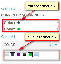
Default size and border radius for all color swatches can be set.
- Width (Picker) - width in pixels of color swatch.
- Height (Picker) - height in pixels of color swatch.
- Border Radius (Picker) - border radius in pixels of color swatch.
- Width (State) - width in pixels of state element
- Height (State) - height in pixels of state element
- Border Radius (State) - border radius in pixels of state element
Show More Popup
A number of parameters can define visualization of 'Show More' popup:

- Number of Rows in Popup. If elements in popup are arranged into more rows, scroll bar appears.
- Number of Columns in Popup- how many columns of options.
- Show 'Please Wait' - obsolete setting.
- Show Network Errors in Frontend - obsolete setting.
Category Tree
If category is show as a tree - Show Category Filter As is set to `Tree', it is possible to set how it should be visible on page load.
Expand All Tree Items on Initial Page Load. Tree remembers collapsed/expanded state of each category, so on subsequent page loads remembered collapsed/expanded state is restored and not touched items are processed as specified here.
Yes
No
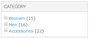
Expand Currently Applied Item on Initial Page Load
Yes
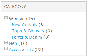
No -currently applied item is expanded/collapsed based on the above setting
Radio Buttons
Show 'All' option - It is possible to show or hide 'All' option:

Sliders
Style - style of all sliders can be set
Style 1
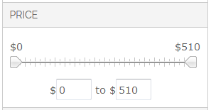
Style 2
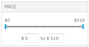
Style 3
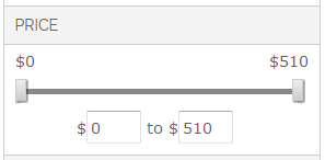
Style 4
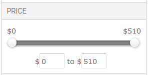
Other Settings
- Adjust Configurable Product Price Filtering. If enabled, additional price tags of configurable product options are additionally checked.
- SOLR Maximum Number of Counted Options. Leave empty to use SOLR server default setting (usually equals 100).

